

Mobile-First Email Design: Tips for Success in a Mobile World
With the increasing use of mobile devices, it’s more important than ever to design email campaigns with a mobile-first approach. In fact, studies show that over 60% of email opens occur on mobile devices. In this article, we’ll provide tips for designing mobile-first email campaigns that drive engagement and conversions.
1. Keep It Simple
When designing email campaigns for mobile devices, simplicity is key. Avoid using too many images, fonts, and colors that can make the email cluttered and difficult to read. Instead, use clear and concise messaging with a single call to action.
2. Use Responsive Design
Responsive design ensures that your email campaigns look good on all devices, including desktops, laptops, tablets, and smartphones. Use responsive email templates that automatically adjust the layout based on the screen size of the device. This will help ensure that your email campaigns look good and are easy to read on all devices.
3. Optimize for Mobile Devices
Optimizing email campaigns for mobile devices means making sure that the email is designed for the small screen size of a mobile device. Use fonts that are easy to read on small screens, and ensure that the email is easy to navigate using touch controls. Use larger font sizes for headings and body text, and ensure that your images are optimized for quick loading on mobile devices.
4. Prioritize the Call to Action
When designing mobile-first email campaigns, prioritize the call to action (CTA). Use clear and concise CTAs that are easy to find, and ensure that they are large enough to be easily clicked on a small screen. Use language that is direct and persuasive, such as “Shop Now” or “Sign Up Today”.
5. Test on Multiple Devices
Testing email campaigns on multiple devices is essential for ensuring that they are mobile-friendly. Use email testing tools to test your campaigns on various devices, including smartphones and tablets. This will help you identify any design issues that need to be addressed to ensure that your campaigns look good and are easy to read on all devices.
In conclusion, designing mobile-first email campaigns requires a simple and responsive design, optimization for mobile devices, prioritizing the call to action, and testing on multiple devices. By following these tips, you can create email campaigns that look good and drive engagement and conversions on mobile devices. With more and more people using mobile devices to access their emails, a mobile-first approach is essential for the success of your email marketing campaigns.
Examples of Mobile-First Email Design:
 Uber:
Uber:
- Uber’s emails are simple, with a clear focus on a single call-to-action.
- They use large fonts and a single-column layout for easy mobile reading.
- Airbnb:
- Airbnb’s emails are visually appealing and responsive.
- They include high-quality images and concise text for mobile users.
- Starbucks:
- Starbucks uses mobile-responsive design in their email campaigns.
- They emphasize visuals, such as product images and buttons to redeem offers.
- Apple:
- Apple’s product announcement emails are designed with a mobile-first approach.
- They feature large, high-resolution images and minimal text for easy mobile consumption.
- BuzzFeed:
- BuzzFeed’s newsletters are mobile-friendly, with a single-column layout.
- They use catchy headlines and images to engage readers quickly.
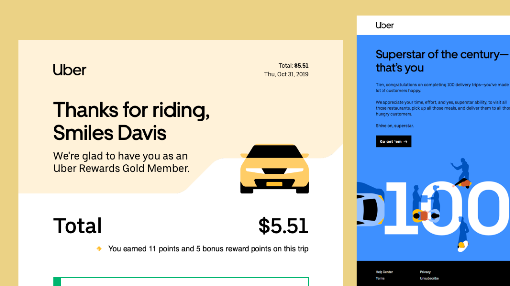 Uber:
Uber:
Remember that successful mobile-first email design is about providing a seamless and enjoyable experience for mobile users. Prioritize simplicity, clarity, and user-friendliness to engage your audience effectively.
